Borealia (pronounced BO - RAY - LEAH) is a Canadian home goods store that sources its products from local artisans and small businesses. By showcasing the works of talented and creative individuals, Borealia supports local communities. Borealia's target audience is Canadian females, mainly of ages 25-45, with a passion for shopping local, cherishing artistry, and supporting small businesses. These women, who are likely homemakers decorating a space for themselves and their loved ones, want to be surrounded by items that carry meaning to them, representing a story and a craft.
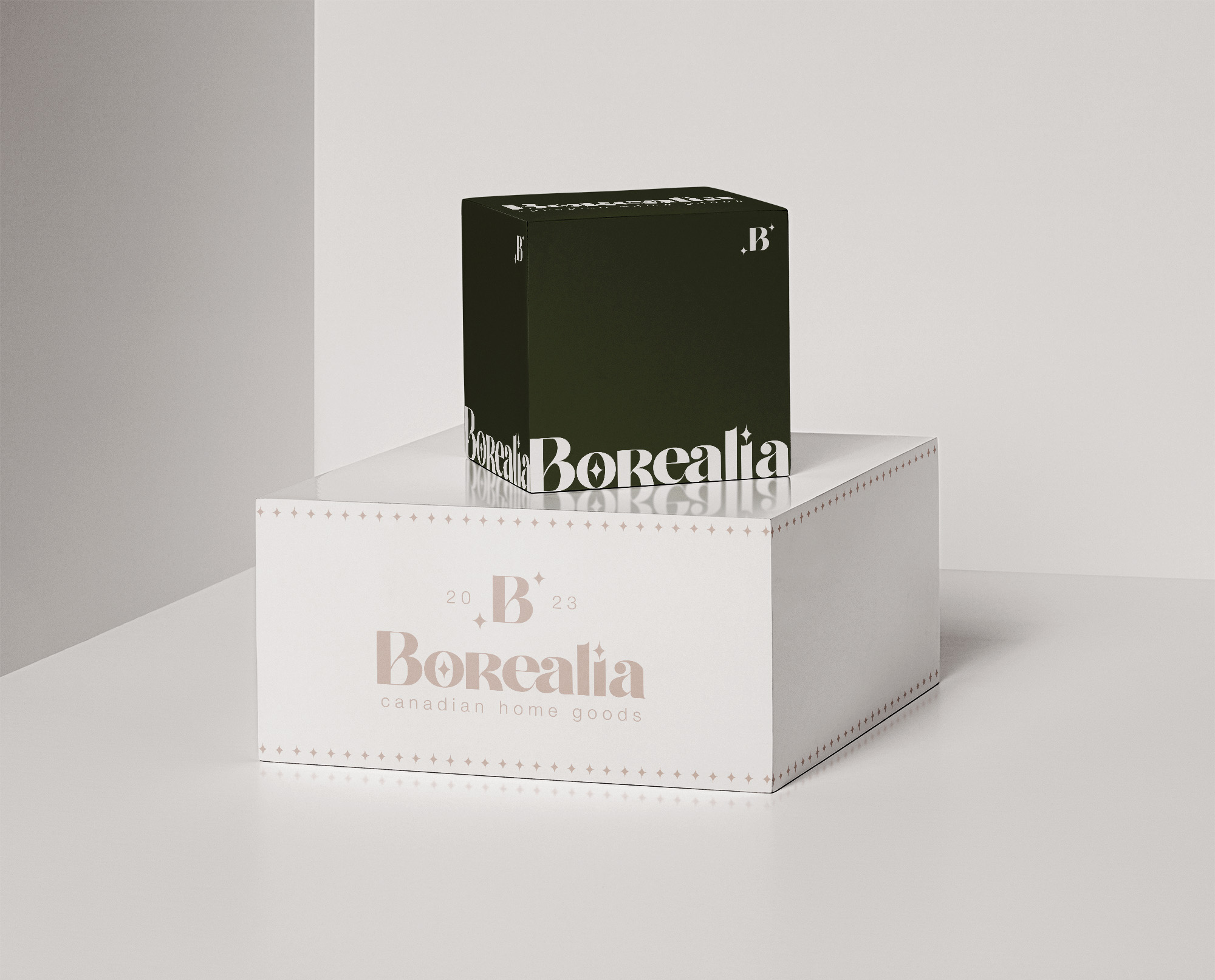
The goal of this project was to design a brand identity that echoes the mission of the company, to bring artisan-crafted, local, top-quality products to people in order to add a touch of local-flare and artistry to their home. This was achieved by an earthy colour palette inspired by natural materials that the artisans would use to craft their items, star symbols representing the concept of the artists standing out and shining bright, and a logo system featuring custom letterforms reflecting the one-of-a-kind value of each of the products.
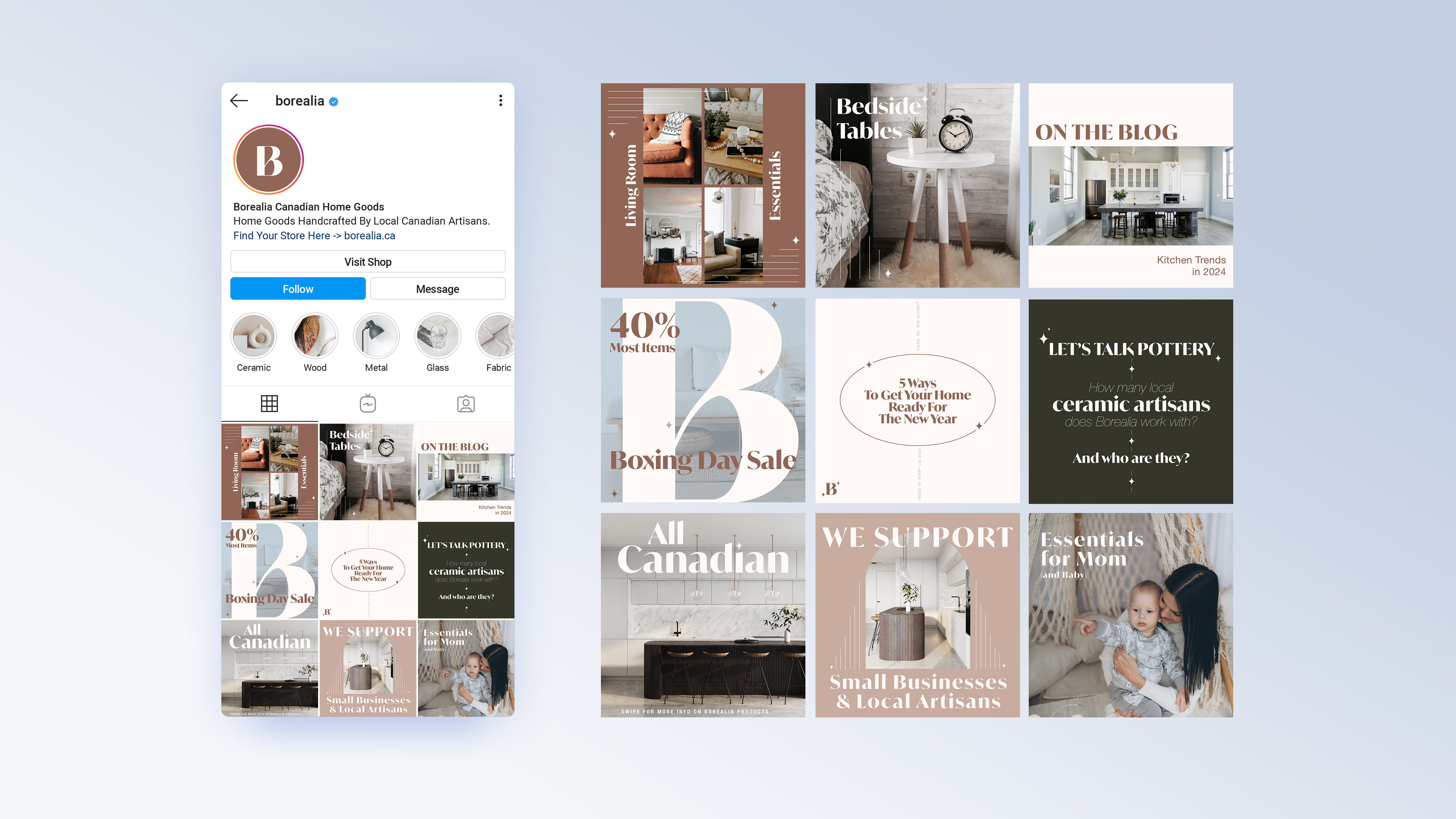
Borealia now has a brand identity that encapsulates the luxury and hand-crafted customization of their unique products. The warm colour palette and sophisticated typography guidelines attracts their target audience and allows them to confidently create on-brand content for their followers.
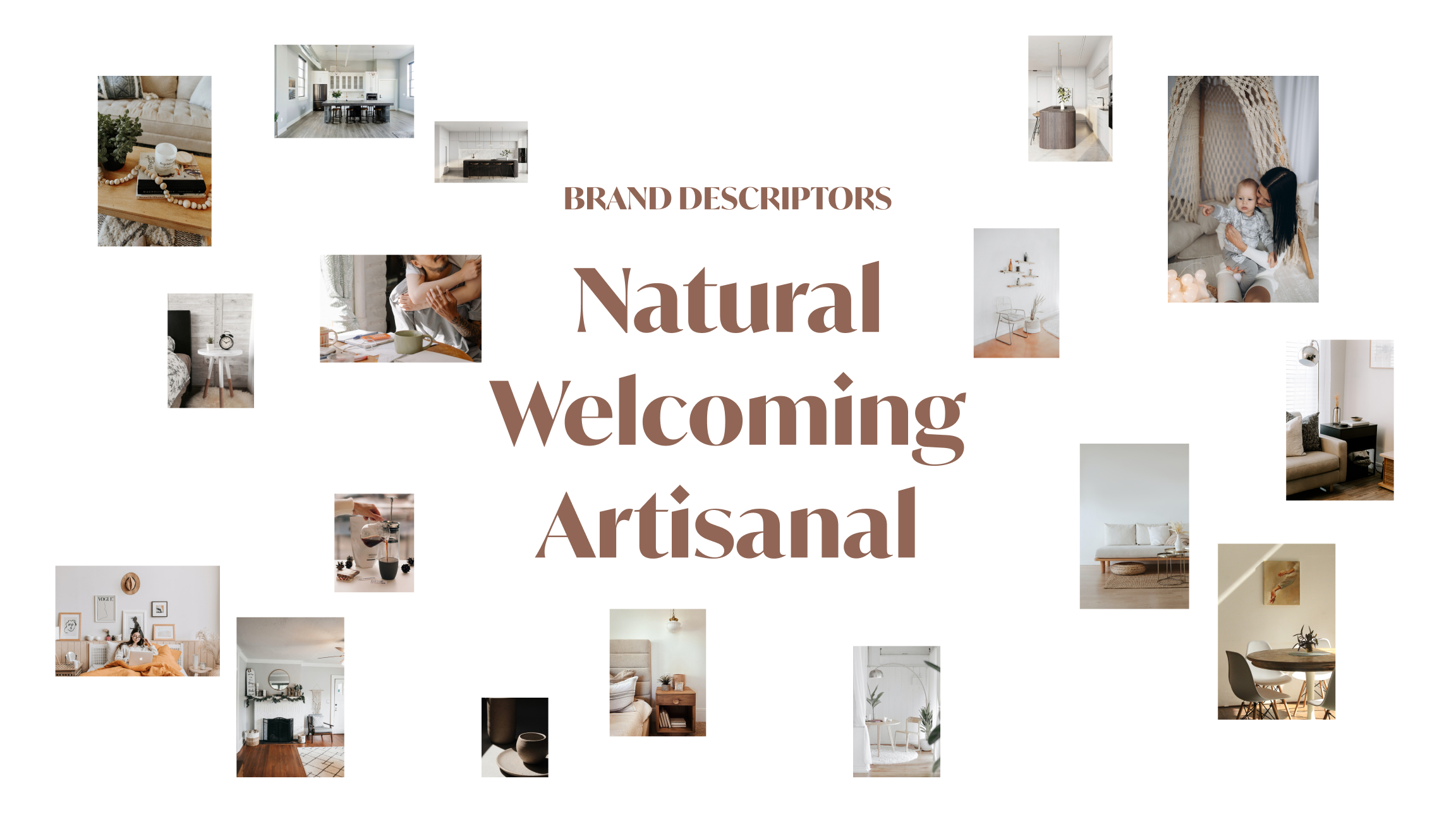
Borealia’s branding is natural, welcoming, and artisanal.
Natural: The branding will live through a nature-inspired colour palette because a huge part of Borealia’s reputation is that the products are made by locals with natural materials. By using a natural colour palette, we communicate the core values of the brand.
Welcoming: When someone purcahses a Borealia product, our goal is to help them make their home more comfortable, personalized, and homey. We want to help our customers to feel like home is a place they want to be. We want to help them create a space that they want to share with others, and for the others to feel at home their too.
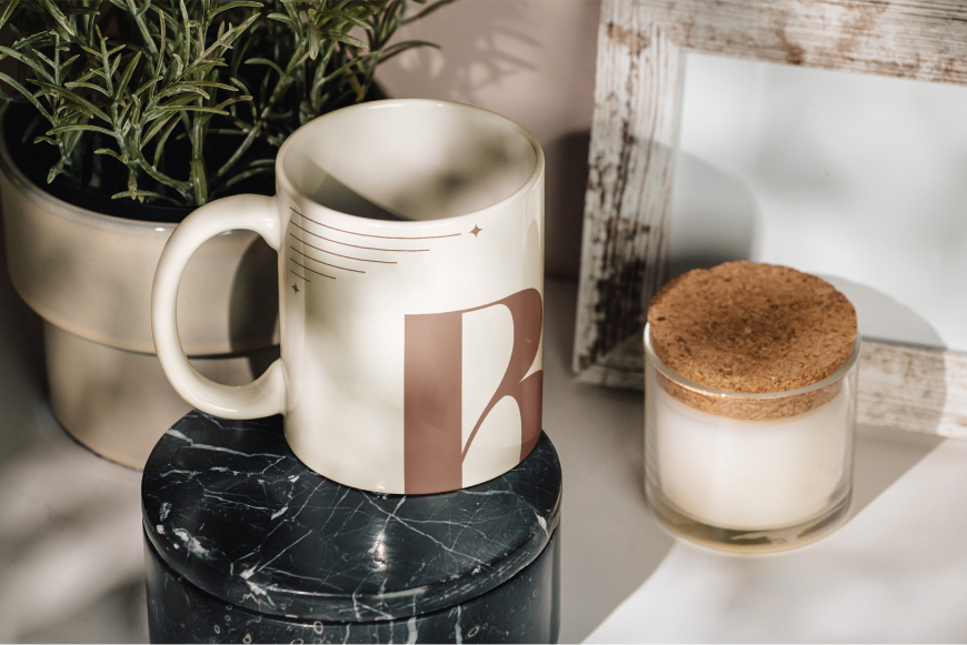
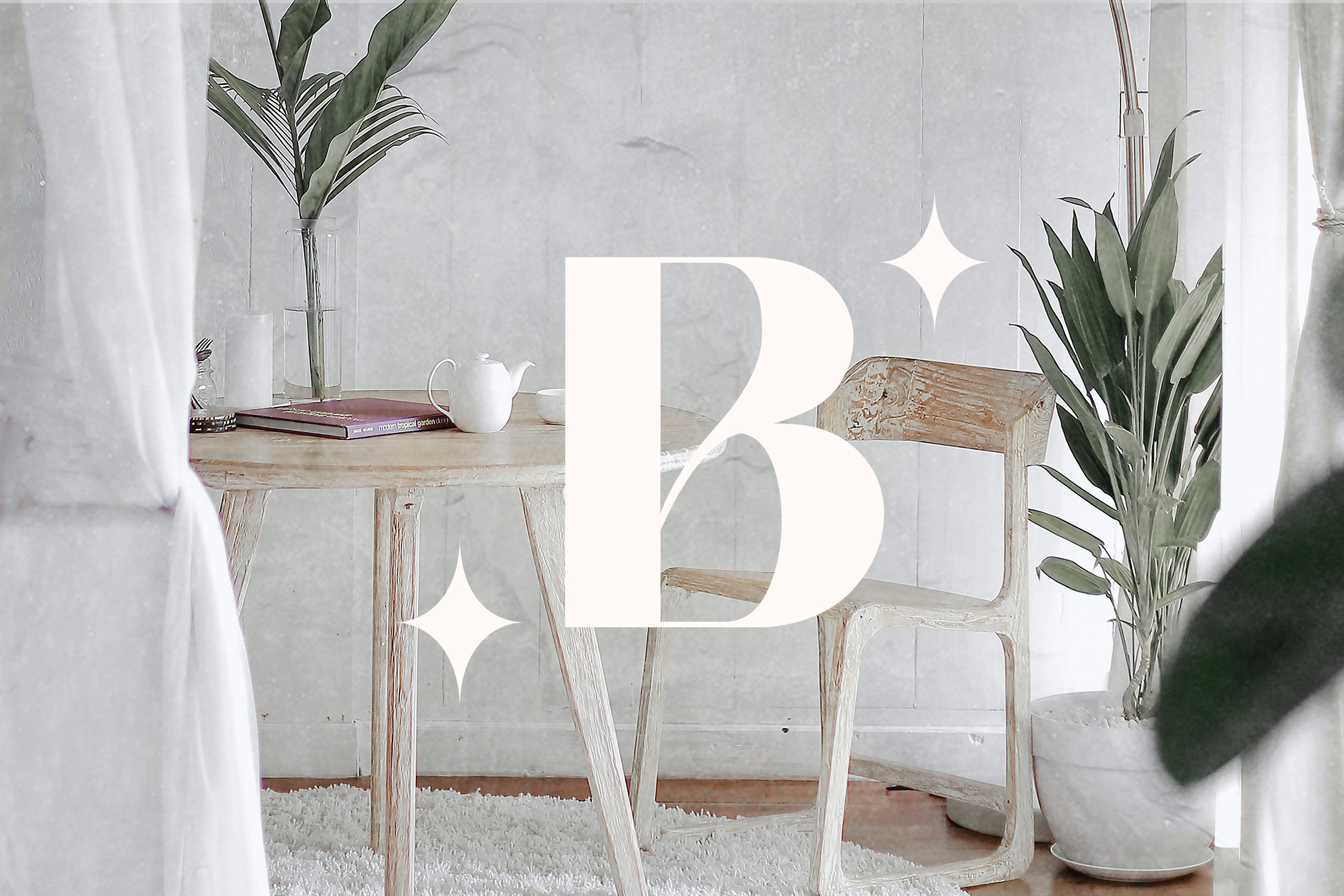
Artisanal: The branding features intricate and delicate typography, photography, and graphic elements to echo the same love and attention goes into each of their handmade, artisanal products.
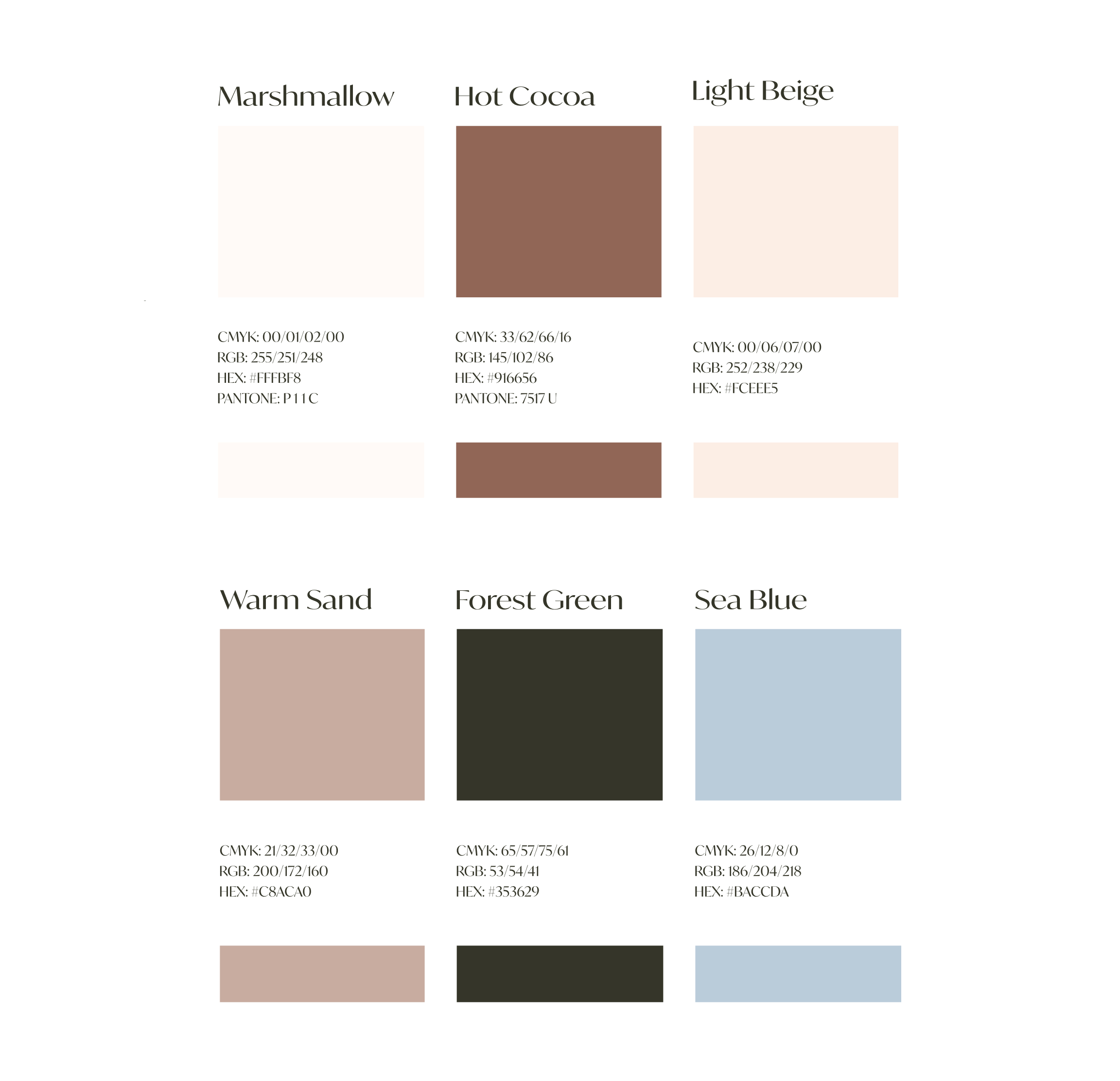
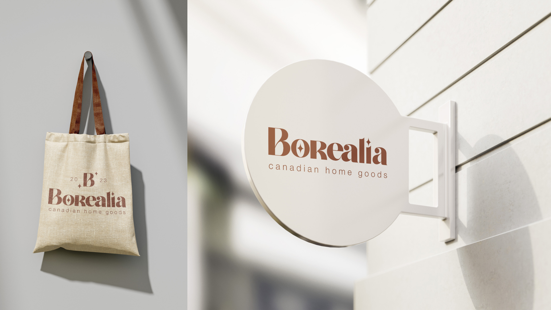
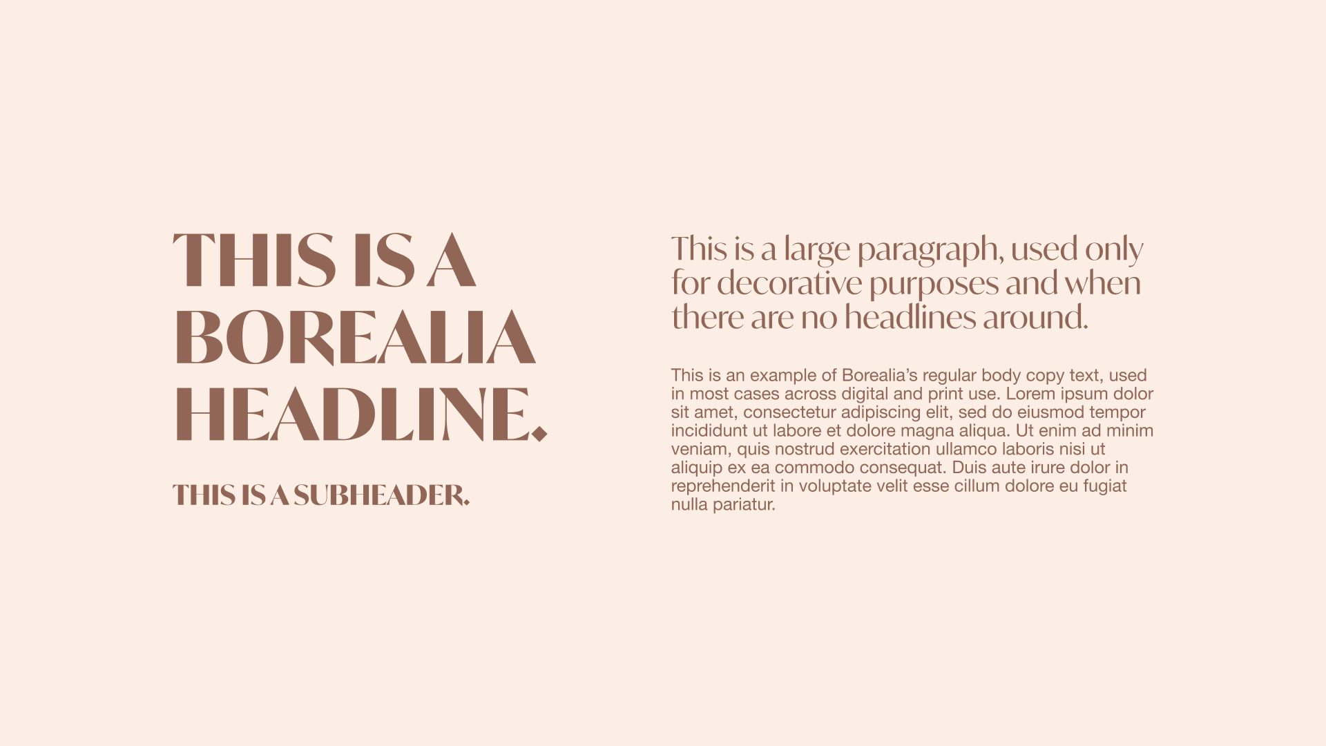
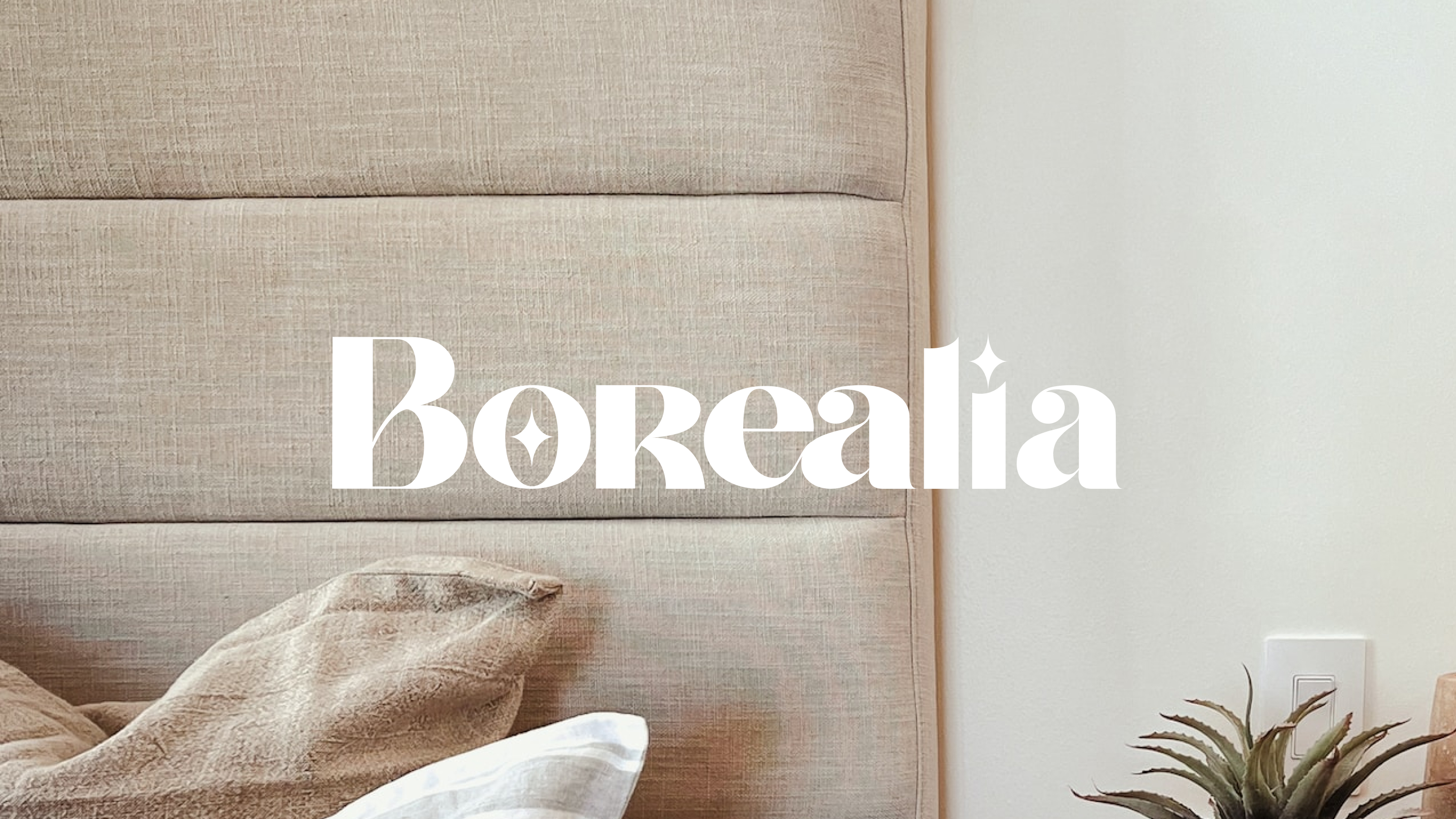
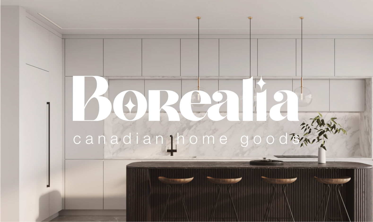
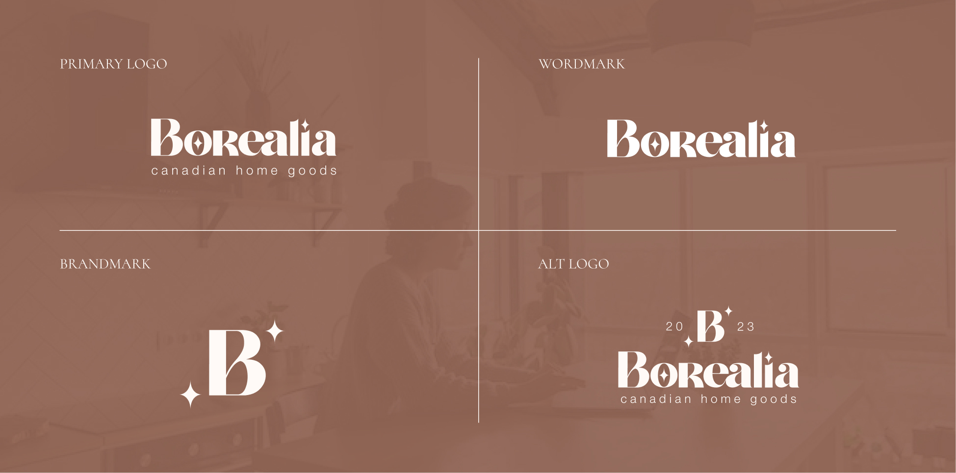
The Borealia logo and brandmarks will be used only in a monochrome style, in only the brand “Hot Cocoa” color, the “Marshmallow” color, or in pure white. This is to maintain consistency across and the brand. The “Hot Cocoa” brown has been chosen as the primary color to produce that natural, handmade, outdoorsy feeling that the brand is centered around. When possible, typographic elements will also be the same color. In most cases, these “Hot Cocoa” coloured logo marks and typographic elements will be displayed on white or cream (textured when possible) backgrounds to bring in more softness to the brand’s visuals.